Friday, June 9, 2017

Which Do You Guys Like Better?

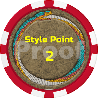
I am making up some Style Chips for Gen Con to use and to give to players and such.

Which design do you like better?


I am leaning toward the first one. I think it looks more professional. The 2nd has larger, bolder text and is easier to read.

The back of the chip will have this design in either case.

Here is the other chip I plan to do.

Feedback is welcome.

3 comments:

  1. I like the bottom one better. IMO it's better if someone can read "manhunters" across the table.

    ReplyDelete
  2. I agree, I like the 2nd one a little better.

    ReplyDelete
  3. Top one if its a bank. Bottom one if its a game.

    ReplyDelete

Note: Only a member of this blog may post a comment.

Iconics 2

Iconics 2
New Paths Compendium: Pathfinder RPG Expanded Edition -- Kicktraq Mini
All for One: Satan's Playground -- Kicktraq Mini
Perils of the Surface World -- Kicktraq Mini
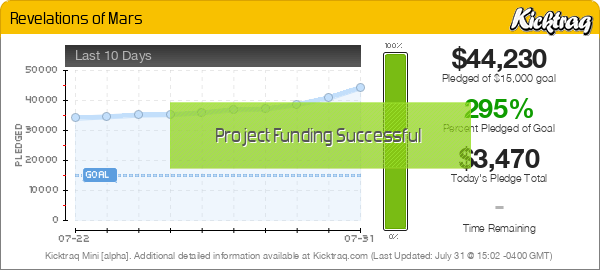
Revelations of Mars -- Kicktraq Mini
Space: 1889 - SF Role Playing in a More Civilized Time -- Kicktraq Mini
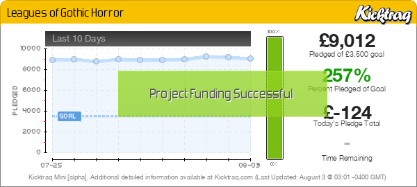
Leagues of Gothic Horror -- Kicktraq Mini
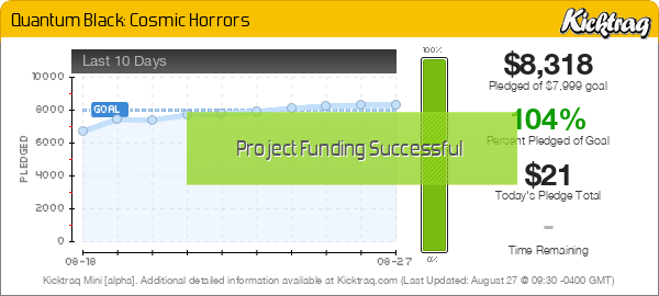
Quantum Black: Cosmic Horrors -- Kicktraq Mini
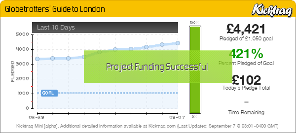
Globetrotters' Guide to London -- Kicktraq Mini
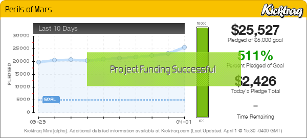
Perils of Mars -- Kicktraq Mini
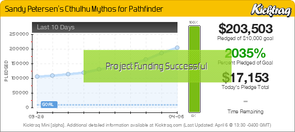
Sandy Petersen's Cthulhu Mythos for Pathfinder -- Kicktraq Mini
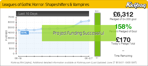
Leagues of Gothic Horror: Shapeshifters & Vampires -- Kicktraq Mini
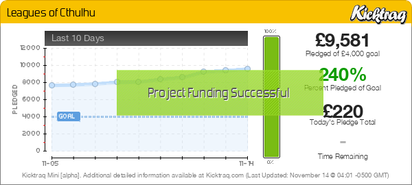
Leagues of Cthulhu -- Kicktraq Mini
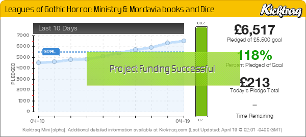
Leagues of Gothic Horror: Ministry & Mordavia books and Dice -- Kicktraq Mini
Pathfinder: Kingmaker -- Kicktraq Mini
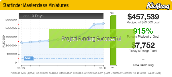
Starfinder Masterclass Miniatures -- Kicktraq Mini